Contact Components
Contact modules provide users with a direct way to reach out, ask questions, or request support.
They are key elements in digital interfaces, designed to be adaptable across different formats and use cases.
In this chapter, we will show you the various modules that can be used for contact purposes.
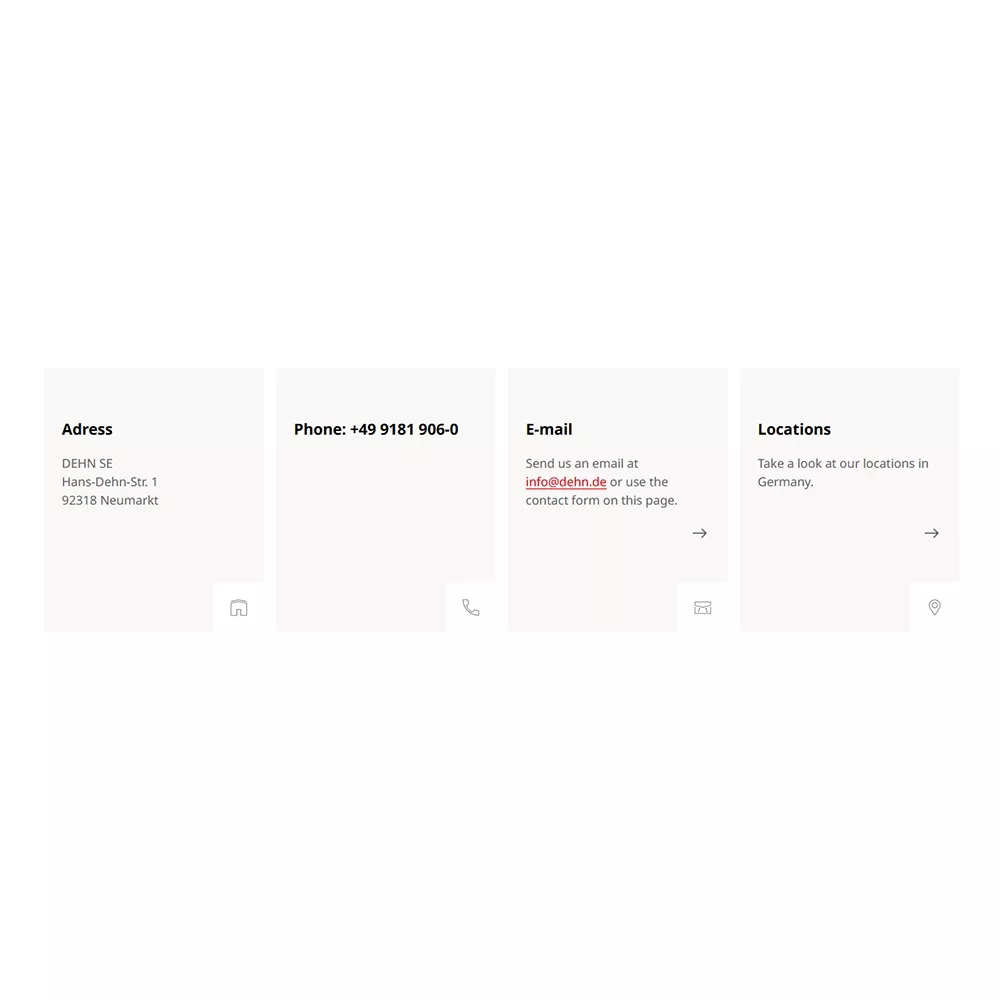
70 | Contact Boxes
Displays four separate boxes for key contact details such as address, phone number, email, and location.
Use case: Ideal for clearly presenting essential contact information in a structured and visually accessible format, such as on a contact or support page.
70 | Contact Boxes: Specifications
🎯 | Character & Goal |
|
✨ | Styles & Layouts |
|
💻 | Authoring | |
Text lengths |
|
Mandatory fields |
|
💡 | Hints | |
Tips for maintenance |
|
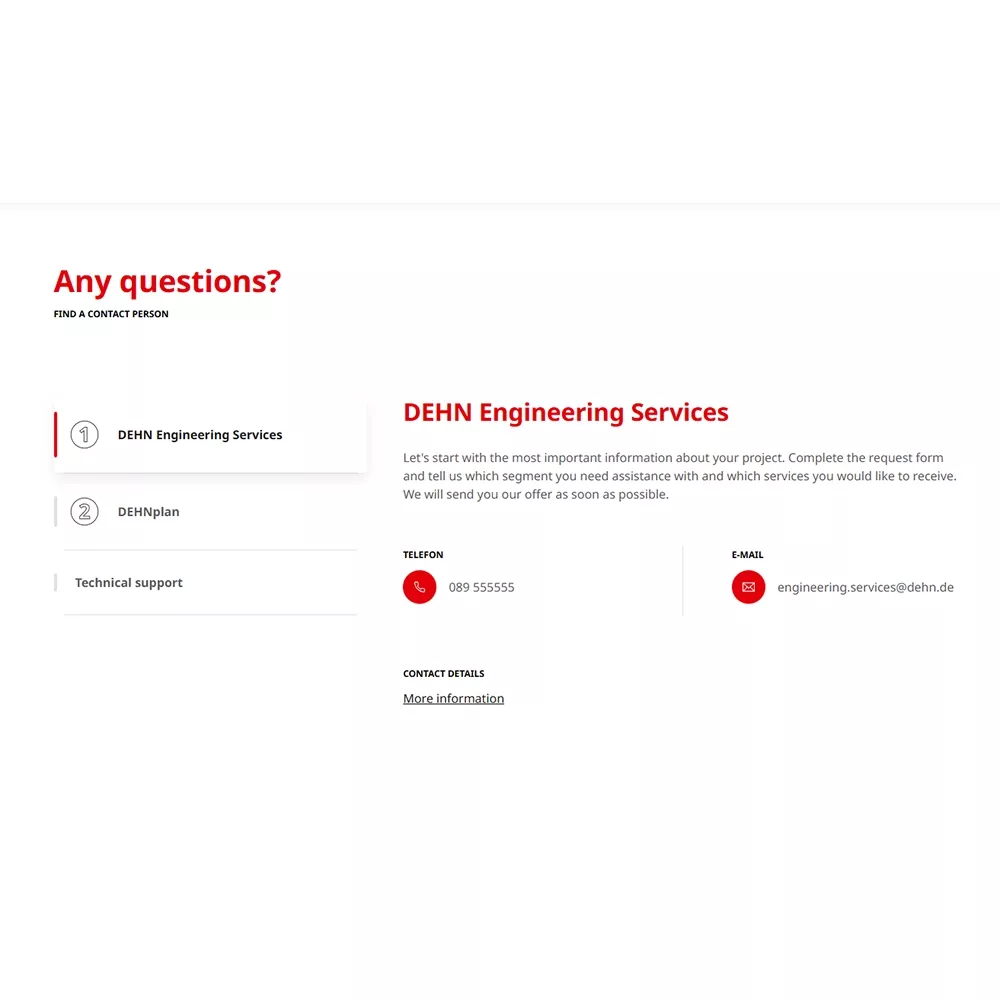
71 | Contact Details
Shows various contact details in a compact list format. Additional information like phone numbers or email addresses appears when the list is expanded.
Use case: Useful for keeping pages clean while still offering detailed contact options, especially for departments or service areas.
71 | Contact Details: Specification
🎯 | Character & Goal |
|
✨ | Styles & Layouts |
|
💻 | Authoring | |
Text lengths |
|
Mandatory fields |
|
💡 | Hints | |
Tips for maintenance |
|
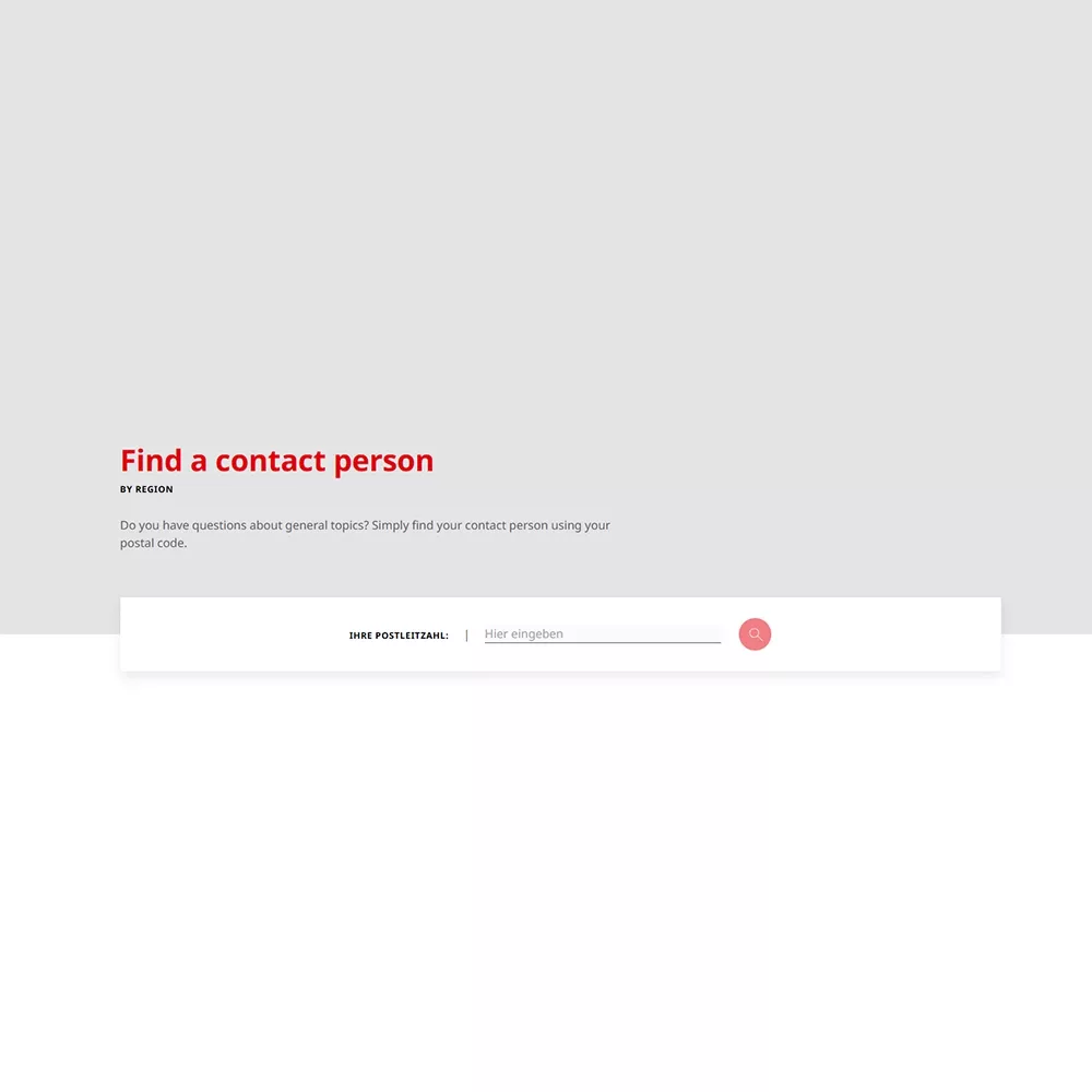
72 | Contact Person Finder
Allows users to find the responsible contact person by entering their postal code (module only usable for DE).
Use case: Perfect for region-specific support or service teams, helping users quickly identify the right contact based on their location.
72 | Contact Person Finder: Specifications
🎯 | Character & Goal |
|
✨ | Styles & Layouts |
|
💻 | Authoring | |
Text lengths |
|
Mandatory fields |
|
💡 | Hints | |
Tips for maintenance |
|
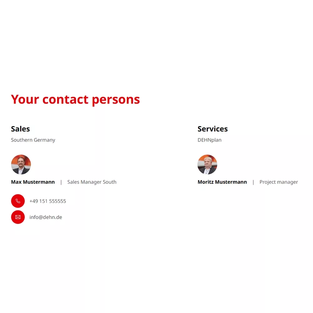
73 | Contact Person List
Displays a two-column list of contact persons, including their area of responsibility, name, job title, email, and phone number.
Use case: Best for team overviews or department directories, giving users a quick and informative snapshot of who to reach out to.
73 | Contact Person List: Specification
🎯 | Character & Goal |
|
✨ | Styles & Layouts |
|
💻 | Authoring | |
Text lengths |
|
Mandatory fields |
|
Images / Videos |
|
💡 | Hints | |
Tips for maintenance |
|
Need Help with Content Settings?
If you have questions or need assistance while editing, you can find helpful information in our general FAQ.
For further support, feel free to reach out.